I study the analysis of systems and am primarily concerned with generating understanding of semi-opaque processes.
For example, we might have a set of cameras we can pair with flight trajectories and use for surveying land. However, while we might be able to easily write down the physical characteristics of the system components (such as the resolution, field of view and spectral sensitivities), it might not be obvious how this translate the interaction of all these parts into actionable results for engineering optimization such as the cost to achieve a given accuracy of prediction of crop yield.
Generally, speaking, this breaks down into the question of “coarsening” a model to obtain the salient effects (such as with surrogate modelling or model order reduction) or providing interpretable representations (such as visualizations) that aid a human decision maker in quickly understanding the nature of the problem at hand or guide optimization towards a better design.
I’m currently a 7th year PhD Student in Mechanical Engineering. My committee members are Daniel Selva, Karthik Sridharan and Peter Frazier.
Websites:
Bitbucket:https://bitbucket.org/Nathan-Knerr/
Contact:
email:
Visualization of High Dimensional Design Spaces with Multiple Criteria
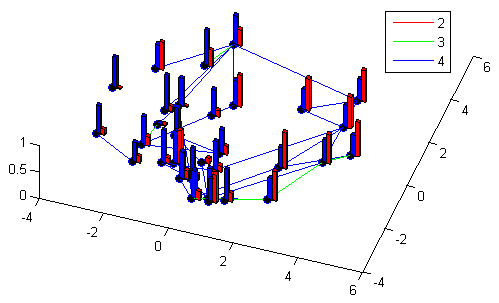
Example Cityplot. Legend indicates ‘true road length’–the distance between designs in the original decision space. Blue towers indicate Performance and Red are Cost.
In many engineering applications, we have a sense of the similarity of multiple designs. For example, when deciding to include optional features on a car we can represent the design as a 0/1 vector for “not present” or “present” for each decision and then define the similarity as the number of different choices between two different designs. In such high-dimensional spaces it can be a challenge to intrinsically understand how different designs relate–especially after evaluating for things such as cost, weight and overall quality in the face of interactions between decisions. To help understand the relationships between interacting decisions and similar designs, we map the space onto a 2-d surface and then represent performance metrics (such as cost) visually to give a representation of the space.
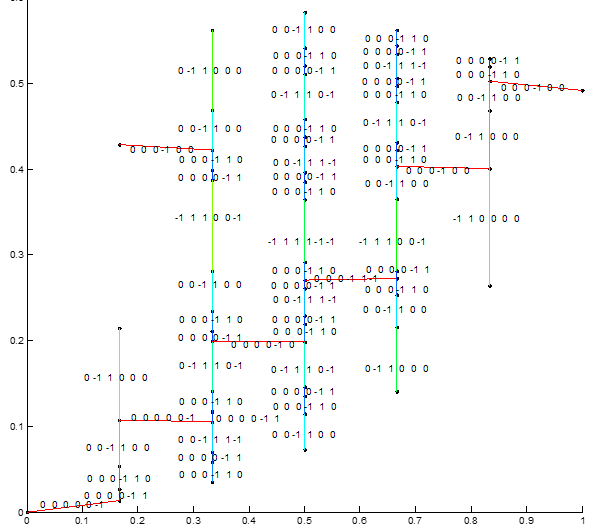
Multi-Objective Mining of Significance
Changes with Linked designs. Lines are colored by distance and labels indicate changes between designs linked by lines.
A common observation when looking at a plot of a multi-objective performance space is that the set of designs is ‘clustered’ and designs fall into distinct performance ‘levels.’ For instance, there can be distinct segments of cost-versus-risk corresponding to the inclusion of redundancy for a particularly unreliable part. We treat these groups as corresponding to the ability of a decision maker to change between related designs and find the underlying sets of decision changes which drive changes in performance. Ultimately, we obtain a hierarchy of significant decisions by use of clustering and matching.